Latest
Reporting on peak performance: how to visualise your data
For most retailers and particularly those who trade online, November, December and January are key months in the retail calendar. To start with, Black Friday is now a global online phenomenon and consumer demand on retailers to discount has never been as high.
Each year retailers face more and more aggressive discounting and promotions entering the market earlier. Black Friday is no longer simply just a day; some retailers have started discounting products as early as the beginning of November. These three months are key as retailers have committed greater spend on marketing and advertising through various channels than elsewhere in the year.
Understanding behaviour and performance numbers before, during and after peak retail periods is paramount. It’s important for gauging strengths and weaknesses, identifying new opportunities for planning campaign activity in the year ahead and mitigating any risks and threats.
Why is data visualisation important?
Data analysis and how we visualise data is important as it helps us make sense of the numbers and see insight quickly. It also allows us to make well informed decisions regarding our marketing and advertising, which ultimately helps us improve performance in the following years.
Data visualisation can help us answer critical questions around peak performance, such as:
- Did we generate more revenue than last year?
- Did we hit our targets?
- What effect did our promotions have on our performance?
- How did customer behaviour change over key trading days?
- How did the level of competition change?
- How did our category and product mix change over time?
Best practices for data visualisation
Debate about what makes good data visualisation divides many people online. Andy Kirk, aka VisualisingData, suggests that “Data visualisation is a game of decisions. To make the best decisions you need to be familiar with all your options (things you could do) and aware of the things that will influence your choices (things you will do).” Meanwhile, Cole Nussbaumer Knaflic, aka StorytellingwithData, believes “Visualisation sits at a fun intersection between art and science; science in the guidelines and best practices, but also artistic in the many choices one can make.”
When creating a chart to display your data, Kaiser Fung, author of JunkCharts, has devised the Trifecta Checkup, which suggests you ask yourself:
- What is the practical question?
- What does the data say?
- What does the chart say?
Data should be easy to interpret from your chosen chart, so it’s important to remove clutter and unnecessary elements.
One way to achieve this is to undergo the self-sufficiency test, by asking:
- Are you able to identify the insights if any data labels are removed?
- Is it clear what the insights are without any explanation?
If the answer is “yes”, then your work is done.
In the words of French writer, Antoine de Saint-Exupery: “You know you’ve achieved perfection, not when you have nothing more to add, but when you have nothing to take away”.
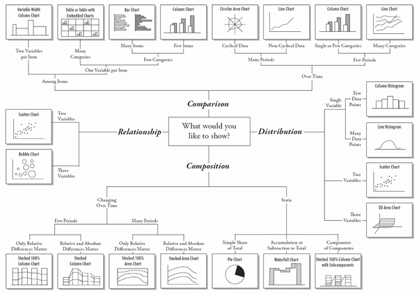
Choosing the right chart
Here’s a useful guide to follow when determining what type of chart or graph to use when you set about visualising your data:
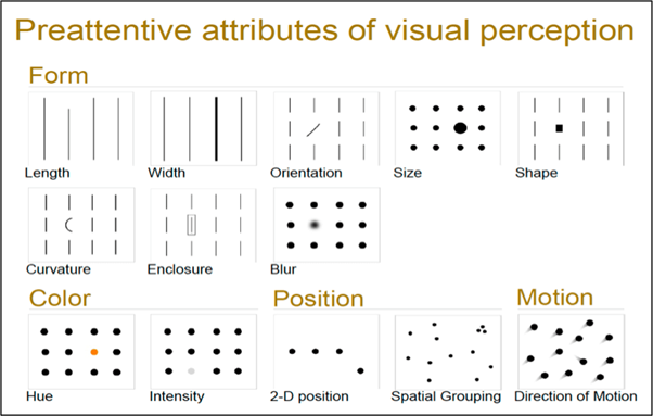
When visualising data, different attributes can be used to highlight areas of interest or takeaways that help to illustrate the story you’re trying to tell.
Here are some useful tips to help you emphasise key insights and increase the impact of data in your graph or chart.
Peak data visualisations
To bring peak data visualisation to life for retailers, we’ve put together some example charts to show how you can display your results and answer key stakeholder questions.
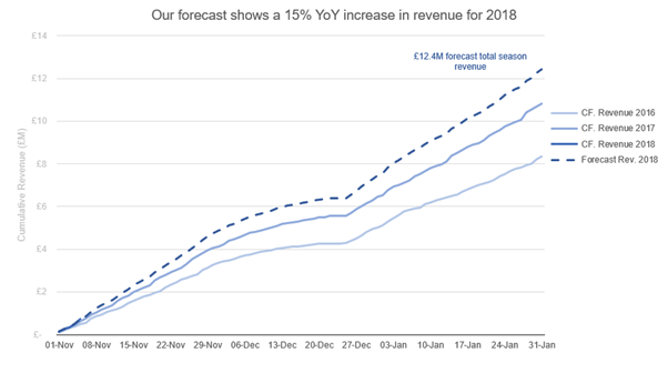
1. Did we generate more revenue than last year?
The line graph below clearly shows cumulative revenue data by week, year on year. The clean and simple design helps you identify the trend and revenue performance easily. Use contrasting colours to differentiate separate revenue years.
Using the same data, a new revenue line can also be plotted onto the graph to forecast revenue next year based on this year’s growth.
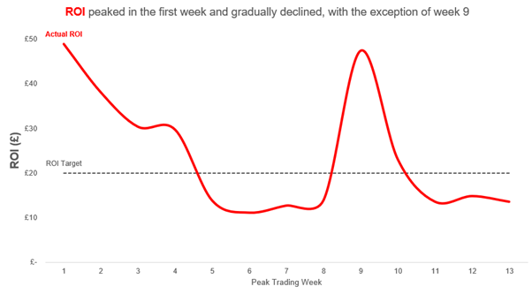
2. Did we hit our targets?
This line graph illustrates return on investment (ROI) per week against a target baseline over the peak period. Adding a baseline helps visualise your target to benchmark success or failure easily. It’s clear to see which week underperformed or overperformed during the period, against the target.
To provide further insight, each spike or drop in ROI could be annotated to indicate when marketing activity and promotions started and ended to gauge impact. This is useful when deciding to push or pull advertising spend in a particular channel for future peak periods. Other metrics that may be looked at to answer this question could be average order value, cost of sale, cost per acquisition, and conversion rate.
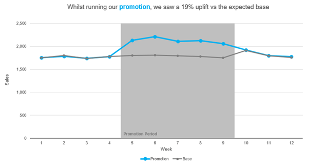
3. What effect did our promotions have on our performance?
This line graph emphasises how sales were impacted during a specific promotion period, versus what would be expected with no promotion during that period. The title of the graph provides commentary to quickly describe the key takeaway, with colour used to explain the data.
This type of chart would be particularly useful when gauging how new promotions or marketing activity performed against existing ones in preparation for your next peak period.
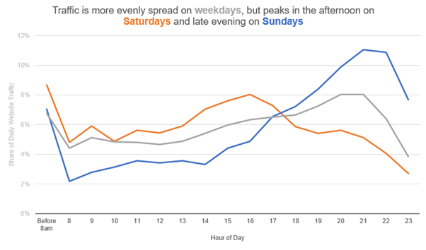
4. How did customer behaviour change over key trading days?
This example graph illustrates how, in the Christmas week, customer behaviour changes by day. The insight clearly highlights how weekday browsing is fairly even during weekdays, but Saturdays see a spike in the afternoon, with the Sunday peak coming later in the evening.
This information could be used to help distribute advertising budget to times of higher interest, in order to ensure maximum exposure in front of target customers.
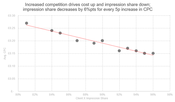
5. How did the level of competition change?
This chart illustrates how competitor activity drove paid media costs per click (CPCs) up during the peak period, and how it impacted on impression share. This data would be useful when forecasting future PPC campaign activity for your next peak period.
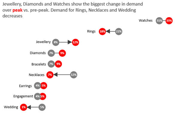
6. How did our category and product mix change over time?
This dumbbell chart illustrates performance by product line during the peak period. Again, it’s very easy to identify which product lines underperformed or overperformed by the percentage change data labels, which show the difference from pre-peak performance.
The insight is also highlighted by colour coding in the title commentary, and arrows to highlight the key points. This insight is useful when deciding to push or pull advertising spend and allocate budget by product line for future peak marketing activity.
As well as looking back, it’s also important to use data to plan ahead for a successful peak. Read our tips on peak planning here, or get in contact with us at info@summitmedia.com for more information.
Ready for change? Let's talk
Speak to Summit